• Work
  • Design
  • Shop
  • Blog
  • About
Jess Rooney Deane
  • Work
  • Design
  • Shop
  • Blog
  • About

Paper food - Food review & paper piece

For this series, I'm going to feature nice places i've eaten in and then make a paper piece of the place as the feature. 

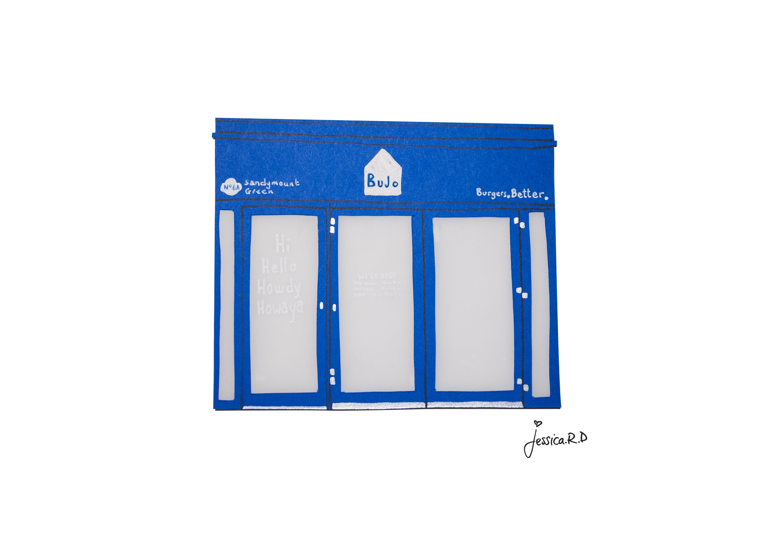
I'm going to start this one off with Bujo in Sandymount. Facing the Sandymount green, just a quick stroll from the sea, you’ll find Bujo. A nice blue building, sitting in the square with the other establishments.

The graphics are beautifully designed on the inside with work on the walls from the Hen’s Teeth 60 x 60 series. The menu is easy to read with a good selection of toppings and choices of fries. If you’re getting a milkshake, i’d suggest the salted caramel and apple, heavenly!

The burgers are delish and you can choose from double, single, veggie and vegan, which is so good! We’ve had the veggie, double and single, all at different times and I can confirm that they’re all amazing burgers! The sides are great too and there is a topping station. I’d suggest throwing a load of the Sriracha powder all over your fries! So good!

Delicious food, good atmosphere and an amazing space! Would recommend :)

Bujo.jpg
tags: burgers, art, paper art, paper illustration, Paper Ireland, paper cut, paper craft, Paper, food, food guide, dublin, dublin food
Wednesday 10.03.18
Posted by Jessica Rooney Deane
 

The Stella Theatre: Past & Present

Before the Stella Cinema has it's amazing facelift, it had this beautiful, stuck in the past facade. The old Stella Cinema was built in 1923 and was a cinema your nanny and granda would remember going to in their youth. It has large letters, a stand out front for the cinema titles, like you would see in an american theatre, and would once light up.

It has now been revamped to this blast from the past 1920's style theatre, inside and out. 

I decided to do a piece of the old Stella cinema before it got its facelift as an homage to the past and to keep the old building alive. And then when the new one opened decided that it would be nice to create that too as a comparison but also because it’s so beautiful, magical and it creates this experience that you’ll remember forever. 

the old facade of the Stella Cinema

the old facade of the Stella Cinema

We went to the new Stella Theatre to see Star Wars and it did not disappoint (both the movie and the theatre). The entrance was beautifully tiled with an ‘S’ right in the middle of the main hallway floor, which lead onto the 1920’s style bar. A real popcorn machine caught my eye which is amazing to see, rather than the premade bags of popcorn they load in, in other cinemas. 

The other amazing part is that you can order hot food and they’ll bring it down to you as you’re watching the film (unreal) and amazing alcoholic drinks.​ When we got to our seats, we had an armchair each with a table in the middle, and a footstool for your feet!! 

IMG_9538.JPG

The whole experience is one to remember and I couldn’t help being reminded of the scene in ‘Annie’ when she’s whisked to the cinema and shown to her seat. It was one of those magical moments. 


IMG_0376.JPG

The new Stella Theatre

Jess :) 

tags: Paper art, Design, Experience, Paper, paper illustration, Things to do in dublin, paper cut, Paper Ireland, paper craft, Past to present, Dublin, Stella theatre, Blast from the past, Old dublin, Art, illustrations, Cinema
Friday 03.02.18
Posted by Jessica Rooney Deane
 

Grand Budapest book cover series: The making of

After seeing the popularity of my previous Wes Anderson book covers that I had made into prints that you can frame and hang on your wall, I decided to carry on in the series and make the rest of the movies as book covers. I decided to start off with The Grand Budapest Hotel, after already doing The life aquatic with Steve Zissou, Fantastic Mr. Fox and Moonrise Kingdom. Since I was doing this recently, I thought i'd share the process in how I make the piece as it might be interesting for some to see. 

As all of the other book covers are overview shots of that characters doing something with their hands, I thought I would keep along the same theme, so it seems as if you are the character. After watching the movie over and over again, I finally decided on the scene in the prison where they are cutting into one of the Mendl's 'Courtesan au Chocolat' with the prison shank/shiv, as it seemed like the iconic pastry in the film. So I started off this piece by looking at the film screen grab and sketching it over and over again until I was happy with the final layout. I also had to head down to Evans Art Supplies and the Art and Hobbie shop to get the exact pastel tone of paper that would suit the piece.

I started off by making the doily that would sit underneath the pastry as I thought it would be easier to shape everything else around that, and also so I could judge how big I would need to make the base of the pastry. After that I made the shape of the bottom part of the pastry and then made another a little bit smaller and another a little smaller than that so there was a large, medium and small pastry. After that I made the shapes for the different coloured icing that goes on each different size. I then cut out the shape of the Mendl's box that the cake would go inside. I lay it all out on my watercolour wood texture, that I painted to be the table the box would sit on, to see what it looked like. I decided that the pastry needed a lot more detail at this point as it needed to seem fancier than it was.

Before that I made the prison shank/shiv that cuts into the pastry, finally being able to use my metallic paper for something. I then shaped the fingers and hand around the shank so it looked like it was holding it and about to cut into the pastry. I wanted to add a bit more texture to the piece so I decided to find some blue ribbon, like the one that the Mendl's box is tied with, and use it in the piece to make it more interesting. After all that was done and the hands were complete I went back to making the pastry look more exciting. I decided that I would paint on the different details to make it look more appetising and glossy like the pastry in the film. I used gouache to add the little details on as it give a nice strong colour and blends well for the detailed parts. I also added gouache to the hands to fill in the details and added a matte top coat nail varnish to the nail parts to make them seem more realistic, it also gives them a nice shine for when you photograph the piece.

It was now time to put it all together, which meant printing out the title block to match the rest of the series of Wes Anderson prints, which you can find here. So I printed it off on the same paper as the others and cut it to size. I then laid everything out to photograph in the layout that I wanted. And finally edited the photo on my laptop until I was happy with the final piece. And this is it, the print will be available to buy very soon, in the same size as the rest of the Wes Anderson prints, on my Etsy and from Jam Art Factory (online and instore).

Hope you enjoyed this weeks post,
Jess x

tags: Wes Anderson, Grand Budapest, book cover, overview, movie, film, grand budapest hotel, Courtesan au Chocolat, mendl's, cover, print, paper, paper illustration, paper cut, pastel, process, series
Wednesday 09.02.15
Posted by Jessica Rooney Deane
 

Disastrous Dates: The process

This week I thought I'd show you how I create my paper cut stop motion animations. I started this project in my last year in college, and hope to continue it with more disastrous dates that i've heard. This is such a long process as it takes hundreds of photographs to complete. You can see the full videos here.

My top products to use when you are making a stop motion animation using flat objects are show above. These are a good quality camera, tweezers to move the little pieces of paper, blue tac to temporarily hold the pieces of paper in place, a tripod so you can keep your camera steady, a flat surface, and some sort of lighting (I usually try and use the daylight from the window, but you can get good lighting from amazon or you can make your own using white lightbulbs). 

All of the stop motion ideas started out the same, with a storyboard. This is where I decided what I wanted the animation to look like. I wanted it to seem as if you're friend was talking to you or bitching about their terrible dates, and then little images that they we're talking about would pop up in the video as if you were imagining what they are talking about. Each of these videos took around 300-400 photographs to make and then put together with the voice overs, that I forced my friends and boyfriend to do. 

Behind the scenes of the stop motion animation

To make different pieces of the face move, you have to move one of the pieces of cut paper a little bit and photograph it each time you move it. I wanted to keep it all about the expression in the face, of you looking at your friend when they are talking, so this bit was very important to get right. Each part of the stop motion is made from watercolour illustrations which are then cut out individually and made into separate moving pieces.  

Moving the mouth piece by piece so it seems like she is talking in the video.

The titles are also the same process of using watercolour cut out letters and a hand drawn signature. I wanted the titles to seem messy and a bit of a disaster to match the theme of the animations. I originally had the titles coming in one letter at a time and really neat but it didn't seem right having neat and perfect titles when the rest of the animation was supposed to be about a disaster. I'd also thought i'd show you how I test these stop motions out on my phone (using an app called iMotion on the capture setting) before taking proper photographs. The iMotion app is so handy for when you want to see what your video will look like, or to see you idea come to life, roughly and quickly, so you can see if it will work or if it needs to be changed or altered in anyway. For me, I thought this title sequence was too neat to match the disasterous dates that were being told so I made it more messy. But here is a sneak peek no one else has seen yet. 

Disastrous Dates: Title draft from Jessica Rooney Deane on Vimeo.

This was always going to be a time consuming process, but the end result is always worth it. With having a 4 year old laptop, this was going to take a little bit longer than expected to match up the voices with each of the photographs in the sequence that I wanted, but I liked how it turned out in the end and I can't wait to make more. I've also added the little moustache test that I made with the iMotion app below.

Disastrous Dates: Moustache test from Jessica Rooney Deane on Vimeo.

Send your disastrous dates to: jessrooneydeane@gmail.com and you might see them come to life in the same way!

Enjoy,
Jess x

tags: stop motion, animation, paper, paper cut, paper illustration, illustration, process, stop frame, frame, movement
Friday 08.14.15
Posted by Jessica Rooney Deane
 

All rights reserved to Jessica Rooney Deane